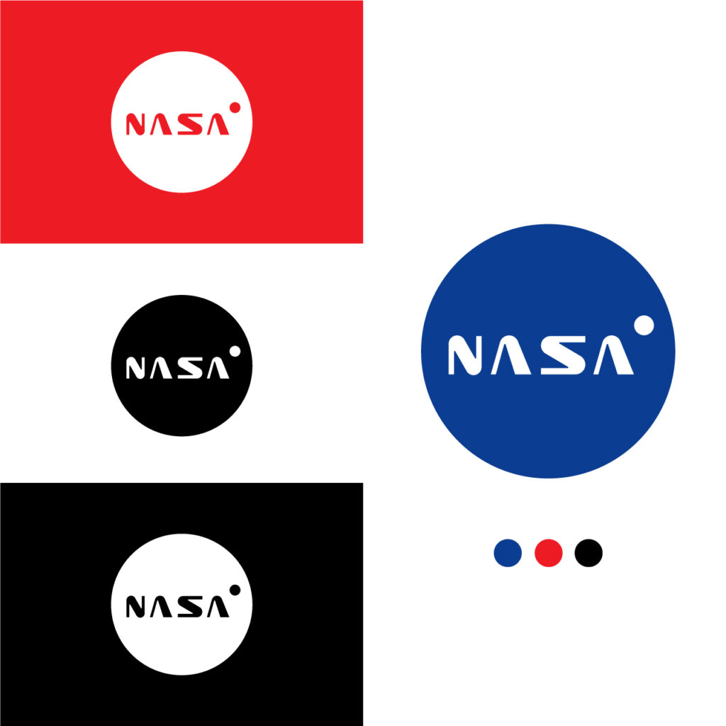
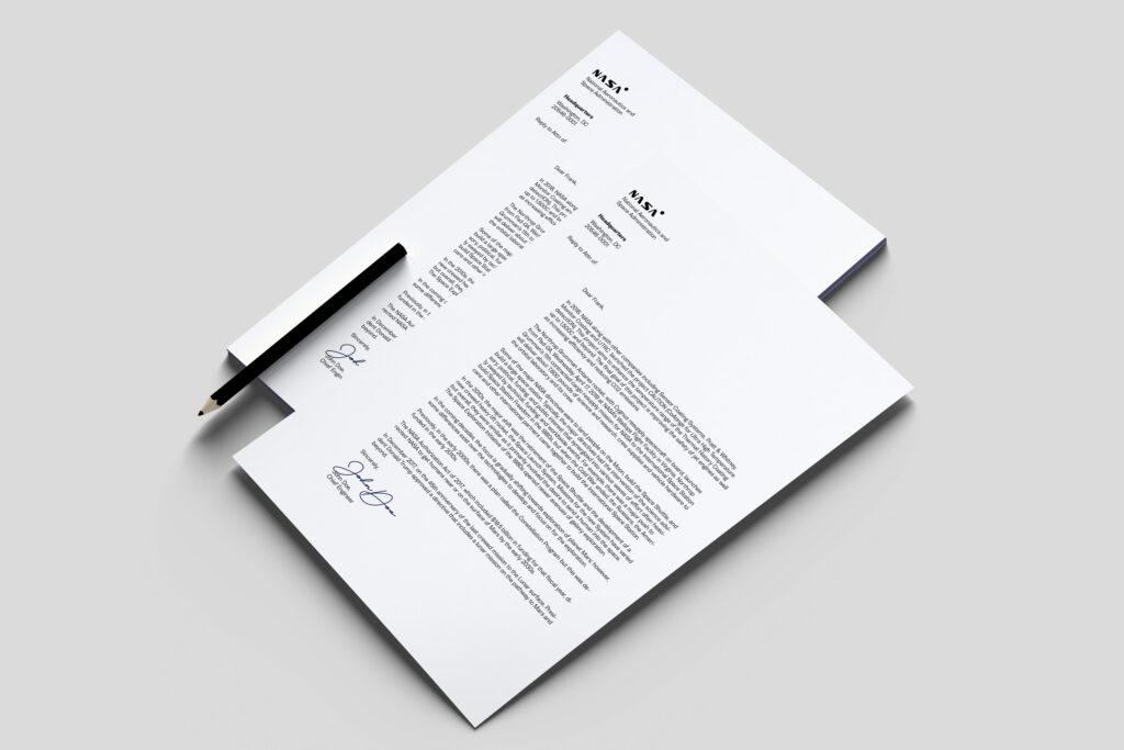
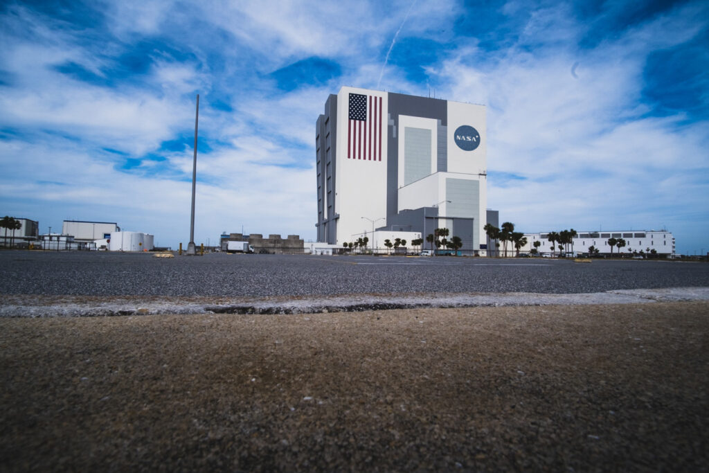
What if NASA did a redesign? How would it look and feel like? This is the breakdown of my process of how I did things. This is not a real project and is not associated with NASA at all. I was nervous when I started the project. It was NASA after all which is a big fella to work with. So I already knew it was going to be a challenging project. But where’s the fun if it’s not challenging, right? NASA which stands for National Aeronautics and Space Administration is a U.S government agency that’s responsible for science and technology related to air and space. To be honest I didn’t know much about NASA and my knowledge about them was limited. I knew that they had something to do with space — so it was important for me to get to know them more in order to really immerse in their environment. I think it was cool to know that NASA helps teachers prepare their students who want to become future NASA workers like engineers, scientists, and astronauts. The info can be found at NASA’s website This stage in the research phase was very interesting to me because I got to see different viewpoints and perspectives. I came to know through my research that they had two logos — The Meatball and The Worm. The meatball actually came back and is their current logo to this day. It replaced the worm logo in 1992. But why? I want to share a few highlights from the articles I have read. Bill Barry the NASA’s chief historian grew up with the meatball as a kid in the 60’s, so there was a natural affection for it. It met resistance, and it was hard to sell the worm logo to an organization full of engineers. Daniel Goldin, the former NASA administrator (from 1992–2001) saw a golden opportunity to restore the meatball since it wasn’t removed and the painting for the worm logotype took a long time to get done on the building. Even Michael Bierut, partner of Pentagram has commented on the current meatball logo. For him was the worm appropriate, and the meatball an amateurish mess. Here is the articles listed if any of you are interested: I had to create goals for the project in order to stay focused. So based on my research I created two goals that I tried to accomplish — but I also borrowed the “how might we” method into my process to rephrase my goals. Defining it this way helped me look at the goals from a different perspective just by rephrasing them. Before I jumped to work on creating the logo and visual ID — I still had one step left to go. After researching NASA, opinions, and statements about the logos and defining the goals for the projects. I needed to braindump some attributes/keywords to create a mood board. What I did was to highlight the positive words used on the different articles that I read and their website. I also added some words myself too. I ended up with 26 words. I highlighted the positive adjectives in the various articles that I read. I also added some extra words which I thought would fit. I ended up with 26 words which I narrowed down to the top 5 — then the top 3 that I could use to create a mood board. On this journey, Pinterest and Photoshop were my companions to create the mood board. Pinterest to find the ingredients and Photoshop to make the dish. It was finally time for me to work with the logo on Illustrator. Since I have written a lot about the process before the design. It was a really difficult task to come up with a logo I was satisfied with. This was no one or two-day work. I took some long breaks in between working on this project. As I referred back to my first goal the “How might we”. It hit me. I thought to myself. What if I combined the thick and thin form of The Meatball and removed its serif — and kept the roundness from The Worm. What would that look like? I was satisfied with the final result. I felt I created a logo that was more modern but kept some elements from both The Meatball and The Worm to honor them. As an extra notch, I added another circle dot inside the big circle to indicate the endless opportunities for space exploration which is yet to be explored. It’s always good to see how a logo would perform in real life — this project was no different. During the project, I ended up working on a custom typeface since I so saw a great opportunity to do so. It was a fun process. I have never done one before. But thanks to The Futur’s typography course and video and the Fontself plugin I finally found the courage to try it out. I would categorize the typeface as a display typeface when used sparingly to make headlines and not as body copy. Overall it was a really fun project to work on. I mentioned that I was nervous, to begin with, but that drifted away. I also really enjoyed writing the process breakdown Writing how it went down gave me so much clarity in my thinking — and something I always can look back to. Whether you’re working on a client project or your own passion/fun projects — keep creating awesome stuff!

A glimpse of NASA
The Meatball or The Worm?

NASA graphics standards manual
How the meatball triumphed at NASA
NASA worm logo
NASA logo shirts swimsuits everything Beat down the goals

The look and feel


Time to use the ingredients and cook the meal


To end the curtain

I explore the intersection of creative living, human potential, and digital leverage.
I'm an optimist, designer & writer who's fascinated by how perspective shifts reveal new paths, inspiring action and change.
Dose of inspiration—delivered to your inbox. Spark your journey of self-discovery and transformation.

Writing prompts to invite you to a journey of deep reflection, keen observation, and creative exploration.

Keep track of your books and favorite parts in one place.
Join 60+ readers getting inspired every other Friday.